
What do I see in the "day overview" chart and how can I use it best?
The graph 'day overview' provides information per hour about the (un)photographed weight in the categories: Kilo, costs and CO2. In this graph you can quickly see at which times food has been thrown away the most. As well as when you filter on categories, you can see the different times where certain food gets thrown away the most. The graph looks as follows:
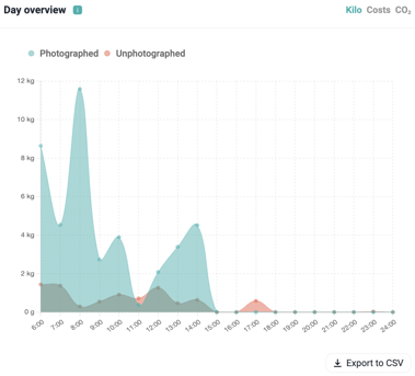
Explanation
- Photographed: is the total food waste photographed.
- Unphotographed: the total weight that has not been photographed in the kitchen. Would you like to know more about how unphotographed weight is created and how you can reduce it? Then read this article.
Are you still left with questions after reading this article? Feel free to send us an e-mail to support@orbisk.com or call us on +31 302270651.